"Strange" Websites
There were things I both liked and didn't like about The Flat and the Youth of Lilliput. To put it plainly, I liked the Youth of Lilliput because it was more straight-forward and "user friendly", but The Flat had a creepier and more interesting design than the Youth of Lilliput. Both were put on a black background, which I found to be a wise choice on both parts, because it simulates the theater experience. I think both made good use of sound, though of course The Flat had a more horror-like feel to it, while the Youth of Lilliput was more strange without being creepy. The integration of text was successful on both: easy to read, easy to follow.
A noticeable difference between The Flat and The Youth of Lilliput was their use of images. The Youth of Lilliput was black and white, and the images were that of landscapes made odd by overlapping layers and a "blinds" effect. The Flat used color images, and the images in themselves weren't that odd, but overlapped with the music, movement, and textures (or the creepy red hand), otherwise normal images were made to feel like they were taken from a horror-film.
The problem with The Flat was that I couldn't figure out how to use it. Once the staircase drifted off-screen, I was left wondering "O. . . kay." I think there should have been a bit more direction on where to click. The Youth in Lilliput didn't have an "in your face" next button, but it was there, and it took far less time to figure out how the site worked. However, there was more freedom of navigation with The Flat. You could pick your own adventure and move about the apartment as you liked, where as with Youth in Lillipute, you could only go forward, as you would a book. It doesn't exactly make Youth in Lilliput's inferior, just less flexible when it comes to navigation.
Overall, if The Flat had used better navigation techniques, I think it would be a more powerful experience than the Youth in Lilliput. So tehcnically, The Youth in Lilliput was best. Creatively, The Flat was more successful.
Carnegie MuseumWhat I tried to accomplish by visiting the museuem was imagining the elements of these works incorporated into webdesign.
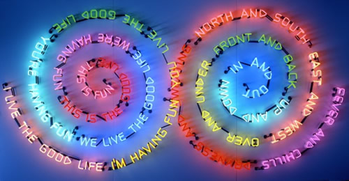
Bruce Nauman's Having Fun/Good Life, Symptoms definitely appealed to my color-loving side. I've always had a fascination with neon signs, as they're both crazy colorful and crazy bright, and only come out when it's dark. You just can't walk by the piece without stopping and looking-- it commands attention. And it does so all without using any images. I also have a bit of an affection for fonts and text. When I saw this, I tried to imagine how it might be used in a website. It would be awesome if you could create menus just like this, ones that went in a spiral instead of just being horizontal and vertical.
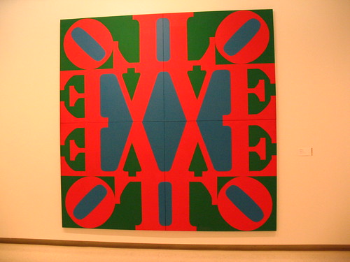
Robert Indian's The Great Love once again appealed to me because of it's bold color and it's bold text. I'd seen the "box" technique used on websites before, and I could also see this as being a innovative type of menu, using the text as a design instead of just relying on images. It's especially important to note, since websites use more text than they do images (at least, most of the time). If one could find a way to use text to create images, you could kill two birds with one stone.
Harry Holtzman's Scuplture (1) reminded me a lot of the webpage set-up, and I could easily see this one animated, the boxes growing and shrinking when the cursor moved over them, to show something behind or underneath them. They could also be implemented as menus. The geometric design would conform itself well to the sphere of the web.


